Common Ecommerce Mistakes: How to Upgrade Your Email Flows in 60 Seconds
Flows, Journeys, Workflows — whatever you call them, they’re the email automation mechanisms that can make or break an ecommerce business.
Set up with the correct timing, links, graphics, segmentation, and messaging, these automated workflows are an absolute boon for merchants who want to nurture and win over high-intent shoppers. But, when executed poorly, these same mechanisms create an inadvertently frustrating and stale experience that instantly turns off would-be customers.
What are the most common mistakes that ecommerce merchants make when building out workflows in their customer engagement platforms? We’ll dig into these top three oversights, and offer advice on how to optimize your flows in less than a minute.
Top ecommerce mistakes to avoid in your emails and SMS:
1. Using generic graphics
2. Using the wrong flow types (or none at all)
3. Using the wrong destination links
Using generic graphics
The absolute biggest mistake that many ecommerce merchants are making is sending high-intent customers content with no personalization whatsoever.
Marketing personalization is no longer the exception — it’s the rule. A recent study found that 76% of customers are actually frustrated with businesses when their interactions aren’t personalized. And customers have growing expectations — they don’t just want their first name personalized in an email subject line. They want an experience that feels personally catered to them. They want to feel special.
Whether because of limited bandwidth, limited budget, or limited technical support, ecommerce merchants often default to generic content in emails and SMS. An abandoned cart flow has a static “we saved your cart!” graphic with no compelling visuals of what was actually in the cart. A post-purchase replenishment followup tells someone “it’s time for a refill!” with no reminder of what that person actually ordered and needs to purchase again.
These emails might check the boxes on a traditional digital marketing plan, but they are so generic that they actually frustrate customers more than anything else.
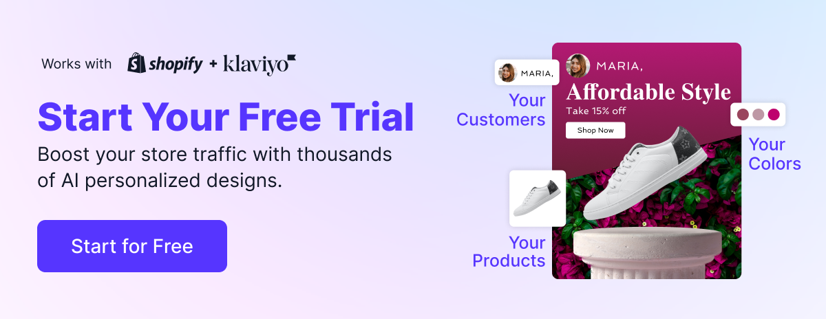
Grid and Pixel solves the problem of bandwidth, budget, and technical complexity by enabling ecommerce merchants to create stunning, personalized graphics in seconds. We’re talking about animated visuals that feature AI-generated product imagery so that each customer sees a completely different email than the next.
Customers who have browsed, carted, and bought are giving you signals about what they like, what they don’t like, and — most importantly — that they’re interested in what you’re selling. Personalized graphics reciprocate those positive signals by showing customers that you’re listening, which is going to bring them back at a much higher rate.
Using the wrong flow types (or none at all)
Automated workflows are wonderful but also plentiful, which can lead to some serious confusion about which flow types to prioritize. In some cases, ecommerce merchants might be so focused on blast campaigns that they overlook flows entirely — which is a huge miss that leaves a lot of revenue on the table.
Generally, flow types fall into these categories:
Product and cart abandonment
Post-purchase follow-ups
Welcome series
Customer winbacks
And within those categories, there are more categories. For instance, there are four different types of product and cart abandonment flows, each with different end goals and purposes.
Take a quick audit of the flows that you do have live, and make sure that the trigger events match the purpose of the flow. Make sure your welcome series goes to new subscribers, and that product review emails send after orders are fulfilled.
Two of the most important flows to have turned on are abandoned browse and abandoned cart flows, because they are going to capture the widest high-intent audience. You can create eye-catching, personalized Grid & Pixel graphics for those flows in less than 60 seconds — start by browsing our abandoned browse and abandoned cart designs.
Using the wrong destination links
Smart segmentation, beautiful designs, masterful personalization — it’s all going to be for naught if subscribers click that email or SMS and are taken to the wrong place.
The more steps you put between a customer and the action you want them to take, the more friction you’re creating for your customers. If you want an existing customer to return to their cart, taking them to the main website instantly puts the onus on them to figure out how to get back to their cart. Why not take them right to the checkout page?
Customer engagement platforms also often have a lot of variables attached to different events, so it can be confusing to know technically where to send people for the most optimized experience and how to add that to the email. And, sometimes, there are simply broken links sitting in live flows — a surefire way to lose a customer’s interest.
Grid & Pixel solves for all of the above. When you add a graphic to your Klaviyo or Shopify flow, our AI engine will analyze the flow type and user history to send customers to the most optimized destination when they click. No more guesswork for you!
Want to start upgrading your flows so you aren’t making these mistakes? Click here to start your free 7-day trial with Grid & Pixel.